
Responsive Images

WideRange Galleries websites are equipped with a fantastic feature for displaying photos at their finest on all types and sizes of screens: Responsive Images!
Summary
• Responsive images look significantly sharper on high-resolution retina screens.
• Large image files are served to large or high resolution screens.
• Smaller image file versions are served to mobile devices with small screens, saving bandwidth and loading times.
• Recommended sizes for responsive image uploads would be around 1800px on the long side.
What are Responsive Images?
Traditionally when an image is embedded in a page, there’s just one image file and the browser loads it. With responsive images, for each photo several different image sizes are provided, and the browser will automatically choose the best one to load based on a variety of factors including browser size, screen resolution, and internet connection speed.
Why Responsive Images?
The responsive images feature has two major benefits: it provides higher resolution image files for large monitors and high-res retina screens, and conversely it supplies lower resolution image files for small devices that don’t need to load a big image file.
The first issue mainly involves retina screens. Retina screens are the newer high resolution screens like you’ll find on iPhones, iPads, and newer iMacs and MacBooks, for example. Before retina screens came along, all websites displayed at 72ppi resolution, and images looked just fine at these fairly low resolutions. But because retina screens have over twice the resolution of normal monitors, webpages and images viewed on retina devices are automatically upsized by 2x in order to maintain the same relative visual size. This means that web images that look fine on a normal monitor will look soft and blurry on a retina screen.
Responsive images solve this blurry retina problem by providing an image that’s twice the resolution, which will look much sharper on retina devices. Similarly, people using large desktop monitors with big browsers will also get to see larger versions of your photos.
On the other end of the spectrum are small mobile devices, which often use slower wireless internet connections. Since more and more people are accessing the internet with these small devices using slower internet speed, it’s important to also provide smaller image files that will load quicker. There’s no need to load a huge 1600px image on a screen that’s only 320px wide! Responsive images solve this problem because the browser will be able to load a small version of the image file rather than the big version, thus saving valuable bandwidth and loading time.
In short, responsive images allow your website to cater simultaneously to both large and small screens, and low and high resolution screens, without any compromises.
Demonstration
To see responsive images in action, I’ve provided an example below along with a normal image to compare. To fully appreciate the responsive image, you really should view those photos on a larger retina screen such as an iPad or retina iMac or MacBook. On a normal monitor you won’t see any difference, while on a retina screen you can really see the difference in sharpness.
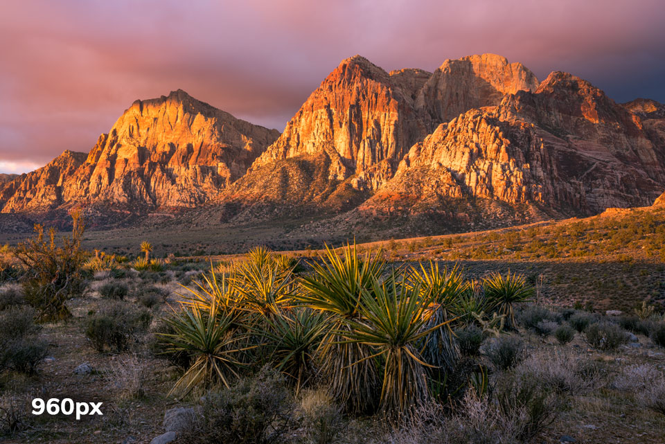

What’s happening in this case with the responsive image is that there’s actually a set of different sized jpg files including sizes of 480, 640, 960, and 1920 pixel widths. In the code we’re telling the browser that there’s these multiple images available and what sizes they are, and the browser is automatically choosing the best one based on the screen resolution and browser size. It only chooses the one that’s as big as it needs, thus saving bandwidth for smaller devices resulting in faster loading times. For high res retina screens the browser knows it needs to load one of the larger images to display sharper.
How to use the Responsive Images feature
The responsive images feature is built-in with all WideRange Galleries websites. All you have to do is upload your web images at the desired size (see below) and the admin will automatically create all the various smaller thumbnail sizes.
What size should I upload my photos?
This is the main question you will need to decide.
The short answer: I do 1800px on the long end, or 2400px for panoramas.
The long answer: There is no definite answer; mainly it’s a personal choice based on the balance between the level of size/image-quality desired vs. your level of comfort/paranoia about posting significantly larger image files knowing that they will inevitably be pirated and shared around the web without your permission.
As for the image quality issue, the key player here is the retina screen. Since retina screens have double the resolution of normal screens, a general rule of thumb would be to double whatever size you’d normally want your images to display. For example, if you intend for your photos to normally display at 800px, then a 1600px image file would be your target to upload to cater to retina screens. In practice, I have found that 1.5x the normal size is probably also suitable for most retina screens.
Personally, I am not comfortable posting my images super large due to piracy concerns. Though our websites offer a superficial download-prevention technique, this can be bypassed (for example, by taking a screenshot) so it’s impossible to fully secure the images. We’ve all seen how our images get shared around the web and used in various ways without permission. It can be frustrating, and by posting significantly higher-res images, the stakes are higher. How much this concerns you is totally a personal decision; if you aren’t too concerned about it and feel that the benefits of displaying larger and sharper images is worth it, then that’s great.
Here’s a brief summary of various sizes based on my experimentations so far:
800px: more or less the standard size we used to use a long time ago before responsive design was a thing; now it's too small and looks blurry on high-res retina screens
1200px: a bare minimum size for normal screens, could be larger and sharper on retina screens.
1600px: nice and sharp even on MacBook retina size screen, this is a good size for average laptop, desktop, and iPad screens. Might still look a bit small on large, high-res screens.
2000px: catered specifically for larger high-res screens, such larger laptop screens or large desktop monitors
2400px: really catering for the hugest screens, not necessary for most displays
Also keep in mind that the larger size you choose, the more “future proof” you will be, as I’m sure as time goes on higher resolution monitors will become more of the norm.
Personally I think the sweet spot is about 1600px - 1800px, but it comes down to a personal choice like I said above about image quality vs. piracy concerns. I have decided that for me 1800px is a good size — it’s large enough to display sharply at a good size on retina screens, but not so large that the files could be printed or otherwise abused too much.
* Note that you should size both your horizontal and vertical images to the same dimension on their long edge. So for example if you choose 1800px as your size, then size your horizontals to 1800px wide, and your verticals to 1800px tall.
* Also note that you do not have to size everything to the same exact size; the website is flexible enough to handle any sizes up to about 2500px. So for example if you want to size your panoramas wider than normal, go ahead and do that.
Watch the filesizes!!!
One consequence of uploading larger image files is that the file size can get out of control. You definitely don’t want to be uploading images that are over 1mb in size — they will take longer to load and will slow your site down. And besides, it’s just unnecessary.
For 1800px images, you should aim for file sizes of about 400-800kb, but not more than 1mb. Remember that since your images are now larger and more detailed anyways, you do have more leeway to compress them a bit more aggressively without losing noticeable quality.
How to generate your web JPG image files
Any image editing software can resize and export JPG files, but here are directions for Adobe's popular software.
Adobe Lightroom: The easiest way to generate your web jpg files is with Lightroom's Export panel (if you use Lightroom). Their Export panel is super convenient because you can save all your export settings as a Preset, then you can export all subsequent web images using the same quick preset. The key settings to use in the Export panel are:
- File Settings
- Image Format: JPEG
- Quality: 65
- Color Space: sRGB
- Image Sizing
- Resize to Fit: Long Edge
- enter your target pixel size (discussed above)
- Resolution: doesn't matter (you can do 300ppi, 72ppi, or whatever)
- Output Sharpening
- Sharpen For: Screen
- Amount: Standard or Low
You can also configure a small, unobtrusive Watermark to automatically be applied to your jpg images, if desired.
Adobe Photoshop: If you don't use Lightroom, Photoshop also has a simple Export panel, at File > Export > Export As. Here are the setting you can use there:
- Format: JPG
- Quality: 6
- Width/Height: enter the target pixel size for whatever is the longest side, then the other dimension will automatically adjust accordingly
- Resample: Bicubic Automatic
- Color Space: select both Convert to sRGB and Embed Color Profile
As always, also be sure to embed the sRGB color profile in your web images so that they will maintain consistent colors on various monitors.
Enjoy your sharper photos!
As mentioned earlier, if you really want to see the Responsive Images feature in all its glory, you should view your site on a larger retina screen like an iPad or retina iMac or MacBook. Then you will see how nice and sharp the images look — with both the gallery thumbnails and the individual photo pages.
As always, please contact me if you have any questions!
